
Sorry about the blatant outright cliché in the title, but honestly, I just can’t think of a better way to describe the recent moves in US dollar implied volatility…
The chart below shows the US Dollar Index (CURRENCY: USD) versus our index for US dollar implied volatility, and the bottom line is that it has crunched down towards record lows in recent weeks.
This is quite rare, and something that has on a few occasions been a harbinger of a large move/turning point.
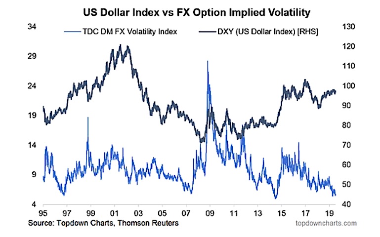
Specifically, the indicator takes an average of 1-month option implied volatility across 11 different developed market USD-XXX pairs. In other words, it gives an indication of the general level of implied volatility for the US dollar.
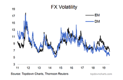
Just quickly, for those who might be interested, here’s the same kind of indicator, but for emerging markets (from the Global Cross Asset Market Monitor). It’s pretty much the same story for emerging markets: i.e. EMFX vs USD implied volatility has been crunching in too.
So what’s behind all this and why does it matter??
OK, so first of all, let’s look at how the US dollar has been trading…
What’s the first thing you notice in the charts below?
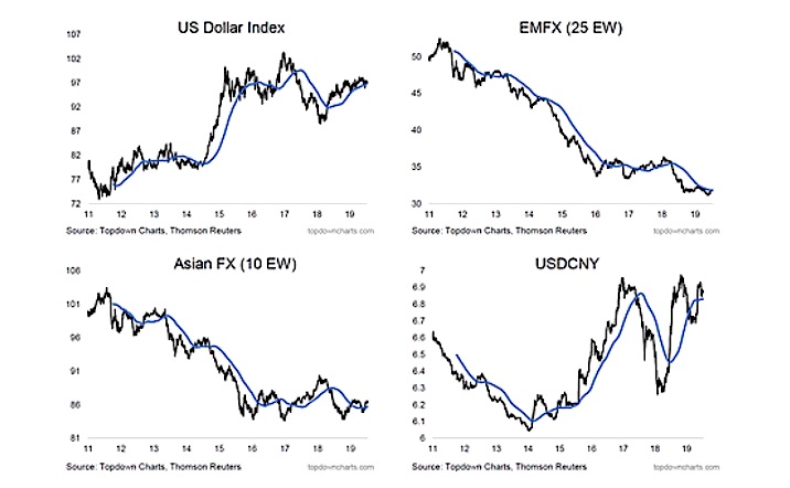
If you said “nothing”, you’re basically on the money! The US dollar index (DXY) and my own equal weighted EMFX (emerging market currencies) index have been locked into a very tight trading range, with more than 1 false breakout showing up across those 4 key USD charts.
Implied volatility typically tracks closely with realized volatility – of which there is very little.
Historically this type of trading often precedes either a turning point, a large/violent move, or both....